Android Design site brings UI designers up to speed on Ice Cream Sandwich
Jan 13, 2012 — by Eric Brown — from the LinuxDevices Archive — 11 viewsGoogle launched an “Android Design” website that offers an in-depth style guide for Android 4.0 app developers. Explaining how to create apps for both smartphones and tablets across multiple vendors and devices, the guide gets down and dirty on details such as themes, notifications, typography, navigation, multi-pane layouts, and much more.
 Google announced Android 4.0 ("Ice Cream Sandwich") in October, and released the source code in November — for the first time spanning Android across smartphones, tablets, and other devices. ICS has yet to reach many shipping devices beyond the original Galaxy Nexus smartphone (pictured), but at CES this week, it was featured in dozens of announcements for products that will ship this year, including relatively low-end tablets.
The Android 4.0 release is so dramatically different from earlier releases that Google decided to launch a new Android Design website to help app developers master the UI components of the release. The guide moves beyond the requirements listed in the API-level developer documentation, providing design advice on how Google believes ICS apps ought to look.
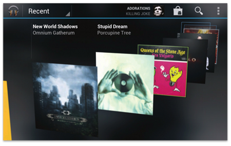
A 3D carousel effect in Android 4.0, from Android Design guide
 Duarte, shown at right in a Wired photo, helped design Android 2.3 ("Gingerbread"), spiffing up the design considerably compared to Froyo. He was also the design mastermind of the Android 4.0 UI revision.
"This is the second part of our Ice Cream Sandwich launch," Duarte told Wired. "As this site goes up, I can feel like it's finished. Like ICS is truly complete."
The Android Design guide helps developers produce Android 4.0 apps that can be more easily ported across devices. Most ICS devices will also ship with at least some UI extensions, if not a full re-skin. Google has tried to clamp down on this practice, which contributes to fragmentation, despite Google's Eric Schmidt claiming this week that Android is not really fragmented after all.
With the spiffy Android 4.0 interface, there are fewer aesthetic reasons to modify the interface. However, vendors and carriers will no doubt continue to try to apply their brand, citing the need for differentiation.
Apple, of course, avoids this problem with iOS, which is found only on the company's own products. This advantage, combined with Apple's own strict style requirements, is one reason iOS apps tend to look and feel a bit better to the average user than Android apps.
Winning style points
The Android Design guide starts out by outlining the creative vision of Android 4.0, as well as its design principles. An Android app should not only be simple and easy to use, but should be enchanting, according to Google — both "sleek and aesthetically pleasing on multiple levels."
Transitions should be "fast and clear" and layout and typography "crisp and meaningful." And don't forget the app icons, counsels Google, which should be "works of art in their own right."
Other design tips include the notion that "real objects are more fun than buttons and menus." End users should be able to directly manipulate objects, thereby reducing cognitive effort and providing a "more emotionally satisfying" experience, says Google. Personalization is also important, suggests the guide, but it's just as important not to annoy users by continually asking them to repeat the same preferences.
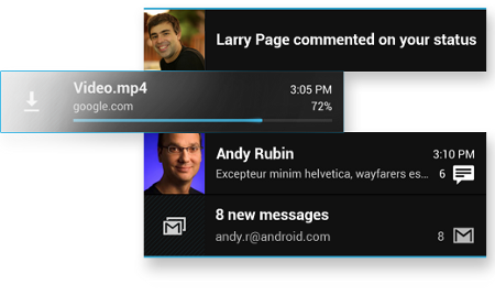
Proper use of notifications in ICS, with a little help from Larry and Andy
 A style section provides advice on devices and displays, touch feedback, metrics and grids, and typography, including an exploration of the new Roboto font. The style guide also covers themes, where it explains the difference between Holo Light, Holo Dark, and Holo Light with dark action bar themes (pictured at left). Other topics include color, iconography, and even writing style.
There's also an entire section on "patterns," advising developers on how to design apps that "behave in a consistent, predictable fashion." Here, developers can explore app structure, and learn how to consistently use gestures, navigation, action bar, and multi-pane layouts.
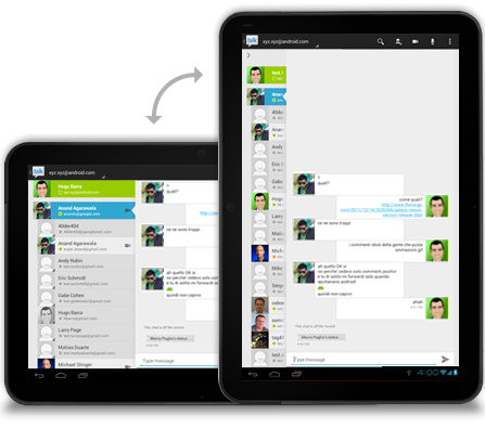
Expanding and collapsing information based on screen orientation
Finally, a "building blocks" section surveys Android 4.0's "ready-to-use elements," including tabs, lists, grid lists, scrolling, spinners, buttons, text fields, and seek bars. This section also explores progress and activity functions, as well as switches, dialogs, and pickers.
This article was originally published on LinuxDevices.com and has been donated to the open source community by QuinStreet Inc. Please visit LinuxToday.com for up-to-date news and articles about Linux and open source.