GNOME Shell and Ubuntu Unity both offer new looks
May 4, 2011 — by LinuxDevices Staff — from the LinuxDevices Archive — 4 viewsWith the release of GNOME 3.0 and Ubuntu 11.04, the face of the Linux desktop environment is changing. This eWEEK review finds there's a lot to like in both the GNOME Shell and Ubuntu Unity desktop environments, although both will take some getting used to.
With GNOME 3.0, the GNOME Foundation has diverged from the consistent look and feel that marked its namesake desktop environment for years. The new GNOME Shell interface represents a new desktop approach intended to make applications easier to access, limit workspace distractions, and make more use of modern desktop and notebook hardware.

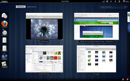
GNOME 3
(Click to enlarge)
Instead, Canonical is offering a separate interface called "Unity." Unity is rooted in many of the same components and designed with many of the same goals as GNOME, albeit with different implementation details.
I've been testing both interfaces throughout their development and in their finished versions — I tested GNOME Shell in the beta release of Red Hat's Fedora 15, and Unity in the shipping version of Ubuntu 11.04. I've found each interface promising. Each does a solid job streamlining notification messages and staying out of the way of active applications.
With that said, both will require that users spend time adapting, and the enhanced hardware requirements of each will prove troublesome in certain scenarios. However, there's time for users and implementers to adjust to GNOME Shell and Unity.
The next Long Term Support version of Canonical's Ubuntu is set to ship a year from now, with an October release of the OS in between to address usability and hardware fallback issues. A 2D version of Unity is already available in the Ubuntu repositories. As for GNOME Shell, it's not clear when the new interface will make its way into the enterprise operating systems from Red Hat, Novell, or Oracle.
GNOME Shell
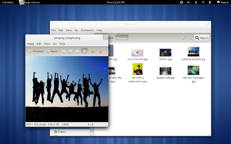
The new GNOME environment starts users off with a blank desktop that seems to serve only as a sort of wallpaper for one's computer — there are icons to interact with, and if you store files in the "Desktop" folder, they don't show up on the desktop.
Across the top of the screen, there's a panel with date and time, volume control, network status, power manager, and a small settings and login button. Moving the cursor to the upper left side of the screen brings the environment to life, pulling up a desktop overlay, with a panel containing application links to the left and a virtual desktops panel to the right.

GNOME 3's new desktop
(Click to enlarge)
Moving the cursor to the bottom right of the screen pulls up a second panel, where applications that typically stay running in the system tray live. For instance, once opened, Fedora's chat application lives in this bottom panel, and when new instant messages come in, a notification window pops up from the panel with the message text.
On my test system, I could respond to instant messages from this same notification window. After opening an application, I noticed that application windows lack maximize or minimize buttons, though I could access these commands by right-clicking on the title portion of the window.
For applications such as the instant messenger client, clicking the "close" button serves the same purpose as minimizing, and the bottom panel provides a place to reopen the minimized application.
The removal of minimize/maximize has been one of the leading complaints among GNOME users over the new interface.
Ubuntu Unity
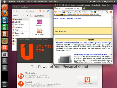
Ubuntu's new Unity interface departs a bit less dramatically from the GNOME 2.x look and feel. For instance, files saved to the desktop still show up there, and the typical assortment of panels, menus, and window buttons remain, although they've been shifted around somewhat.

Ubuntu 11.04 with new Unity interface
(Click to enlarge)
By default, Ubuntu application menus follow the Apple OS X global menu convention — the menu of the active, foreground application appears across the top of the display. I'm not a fan of this menu configuration, so I was pleased to find that it was possible to revert to the previous menu behavior.
As with GNOME Shell, Unity taps search for locating and launching applications installed on one's system, although Unity also suggests applications available for installation from Ubuntu's software repositories.
Jason Brooks is Editor-in-Chief for eWEEK Labs.
This article was originally published on LinuxDevices.com and has been donated to the open source community by QuinStreet Inc. Please visit LinuxToday.com for up-to-date news and articles about Linux and open source.